

Before a prospective employer ever sees you, they will see your resume first. A beautiful resume can make a lasting first impression and separate yourself from other applicants. With just a few simple changes to the resume you already have, you can stand out a little more in the process and increase your chances of getting called back for an interview.
While the information your resume contains is important, so is your presentation of that information. A resume should be bold, organized, and skim-friendly to make the experience as pleasant as possible for the employer. Ultimately, the company is hiring you for your qualifications, not for your how your resume looks, but incorporating one or more of these tips into your resume’s design can help you stand out in a sea of 12 point Times New Roman.
All of the templates shown in this article can be found on Canva.com, a website that helps you create professional-looking documents without any graphic design experience. After you make an account, just search "Resumes" and you'll be presented with hundreds of templates to choose from! Just be warned – many of the templates include an option to include a picture, which isn't a standard part of a resume design. Skip the picture, but use the following tips to revamp your resume design – and check out our article on the content to include in your resume.
Make your name and contact information easy to find
The placement of your name and contact information is crucial. If an employer likes your resume and wants to contact you to set up an interview, you want to make it easy for them to do so. Your name should be the largest text on the page. If you are using a different font for your name, make sure it is bold and easy to read. Also, place your name in the upper-left corner, since this is where a person’s eyes naturally start reading text. Your contact information should appear directly below or next to your name.
In the templates below, your eye is immediately drawn to the applicant’s name, followed by their address. This is because their names are in heavy, bold fonts, while their addresses stand out because of their placement on the page.
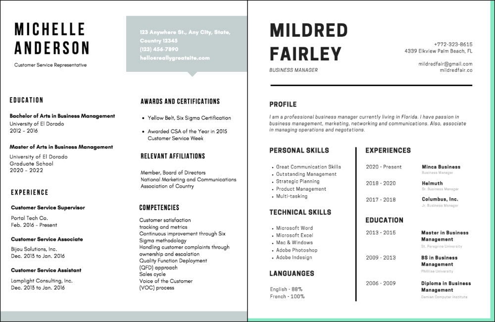
Photo Credit: Canva
Try adding some color
Color can be a great way to make your resume stand out. You can use it to highlight certain information or to break up large sections of text on the page. Avoid using too many colors, as it can make your resume harder to read and confusing to follow; black, grey, and one color are all you need. If you’re having trouble coming up with a color to use, there are a few approaches you can take. Try finding a color that you think represents you: If you’re a happy, optimistic person, you might want to use yellow. If you think you’re more relaxed and easygoing, try blue. Or you can choose a color that represents the industry you want to work in. For example, if you are applying for a job in a biology or a chemistry-related field, consider using green.
The templates below use color to break up information and encourage the reader’s eye to move through the page. This technique can be helpful for those with a lot of information to fit on one page. Just be sure to use a background color that doesn’t interfere with your text!
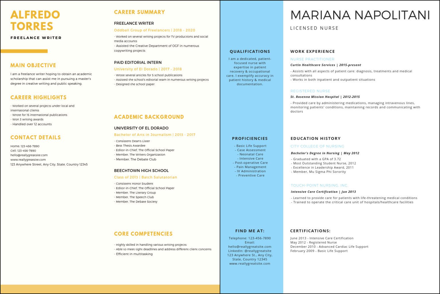
Photo Credit: Canva
Use an unexpected combination of fonts
Changing your font is another way to entice the viewer to read through your resume. Choose something bold for your name and use a different typeface for your headings. (Typefaces are stylistic versions of the same font - bold and italic, for example.) Consider using two different fonts to create visual contrast; this also encourages a person to read all of your information. The easiest way to do this is by using one font for your name and headings and a different font for the body of your resume. To maximize your fonts’ impact on the page, use one serif font and one sans-serif font. Avoid using “fun” fonts such as Comic Sans, Papyrus, or Copperplate.
The template below uses a sans-serif font to emphasize the headings and an easy-to-read serif font for the name and the rest of the page. Sans-serif fonts, like Arial, don’t have extra strokes on the ends of letters. Serif fonts, like Times New Roman, do have those extra strokes, so it’s important to pick one that can be easily read at all different sizes, like the font below.
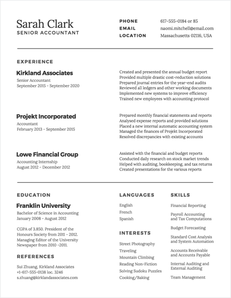
Photo Credit: Canva
Organize your resume by using the grid system
Employers are more likely to want to spend time on a polished, well-organized resume. One of the fastest ways to sort your information is by using the grid system. By lining up your text with other elements on the page, you can create a path for the viewer’s eye to follow from the top of your resume down to the bottom. This makes it easier to skim, creating less work for your employer. One important note: Not every industry organizes resumes the same way; for example, some industries might care more about your prior experience, while others may prefer to see your education first. Be sure to research these preferences beforehand to have the most relevant information up top.
The template below uses a strict grid structure that is easy to read. Notice how the text lines up with the other text below it and next to it. It is pleasing to the eye and allows you to absorb this applicant’s entire work history at a glance!
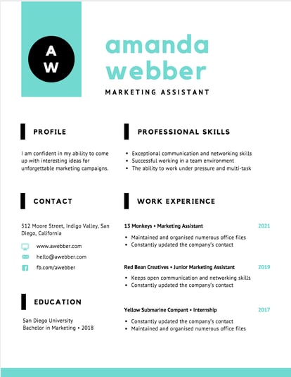
Photo Credit: Canva
Consider white space
White space, or the space on the page that isn’t occupied by text or color, can be a useful tool in making your resume look more unique. By adding extra white space, you can draw the reader’s attention to certain text on the page. This is a helpful strategy to use if you don’t have a lot of information to fit on your resume; using white space still allows you to fill the entire page. Notice how the template below uses white space to draw your attention to the applicant’s name, contact information, references, and the website all the way at the bottom.
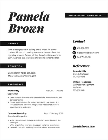
Photo Credit: Canva
Bonus - Don’t forget your cover letter!
So many applicants think that the cover letter is just another piece of paper, but to really set yourself apart, you should consider its design, too. Your cover letter and resume go together, so ideally the design of both should be very similar. Make sure your name is in the same spot on each piece, and that it looks exactly the same - the same font, same size, same color, same everything. Then, write your cover letter in the space below. If you use a color on your resume, consider incorporating a small amount of it into your cover letter, too. Making these two pieces cohesive is a surefire way to get noticed!
Can you picture what the accompanying resume to the cover letter below might look like?
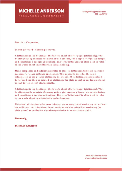
Photo Credit: Canva
With the right techniques, you can design a stunning, professional resume that will have your employer picking up the phone in no time.